deviant art

Deviant Login Shop  Join deviantART for FREE Take the Tour
×

Shop Similar Prints

More from ~Shantonian


×

4,834

139 9 369
Download JPG 3201 × 1273
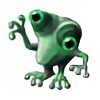
sketched over a scanned 20min doodle, which I did during today's lunchbreak.
Ballpen on Paper, Painter X and Photoshop CS4

Details

Stats

Submitted on
May 3, 2010
Image Size
1.2 MB
Resolution
3201×1273
Views
4,834 (5 today)
Favourites
139 (who?)
Comments
9
Downloads
369
URL
Thumb
Embed
Only verified accounts can report policy violations. Please check your email and click on the verification link.
* Required field
Add a Comment:
 
love 0 0 joy 1 1 wow 0 0 mad 0 0 sad 0 0 fear 0 0 neutral 0 0
:iconcolourbrand:
Mood: Joy *Colourbrand Nov 20, 2011  Hobbyist Digital Artist
Like this ship - solid, funtional, no nonsense - well designed, the textures are fabulous as well as the details and the overall design - you are a great starship artist!
Reply
:iconquandry247:
~quandry247 May 10, 2010  Professional Digital Artist
good work! MOAR please
Reply
:icondani-sang:
I love it :heart:
Maybe I would 3d model it in the future :P with your permission ofcourse XD
Reply
:iconshantonian:
thanx a lot! I thought about building it in 3D as well. I would love to see your interpretation though! As long as you link to my sketch, please feel free! :-D
Reply
:icondani-sang:
cool, don't know when tho. I already did something like this but then my own spaceship: [link] - can't post it on deviant yet because its part of a artpack.
Reply
:iconalexwearshats:
~AlexWearsHats May 6, 2010  Hobbyist Digital Artist
I agree with the previous commenter, the nose area was really well done. I also really like the engine area. Bravo!
Reply
:iconb3w3rtj13:
I like the nose, it seems to have a lot of things going on, the lights in the cockpit/bridge area and the shape of it, the back has something going with the engine area, but it looks slightly cut out, you might want to add some more fuzziness towards the tips of the burner heads formed by the blinding light of the engine blast. the middle bit with all the containers seem dull, you have the cross bar shapes and red lights going but it seems to need more, something for the viewer to look at for longer than 2 seconds and think about, how will they open, move, or something, maybe that area could contain other equipment as well? anyway, just my point of view.
Reply
:iconshantonian:
Thanx a lot for the constructive and detailed feedback! That kind is exactly what you hope for when you request critiques. :)
I agree with you in all points. Some of them occurred because the screen lightness is slightly different on my wacom tablet than on other screens. I started to put this ship into CAD, hopefully I will have spare time enough to finish it soon and solving the issues you mentioned.
Reply
:iconb3w3rtj13:
It was an absolute pleasure, I always try to inspire people to give me actual critiques but it never happens, people always say the like it or its pretty or some poo but at the end of the day its useless if no one bothers to tell you what they don’t like. If you don’t mind, I have an artwork called Girl 2, I don’t know if you have taken a look at it, but I would appreciate it if you could give me some critiques on it. If you have time.
Reply
Add a Comment: